QR Codes People Actually Scan: Contrast, Size, Quiet Zone & Logos
Design QR codes that scan fast in the real world. This guide covers contrast, the required quiet zone, how big to print for different distances, when to use logos, and how short links reduce density for better reliability.
Quick start: high-scan QR in 60 seconds
- Use a short URL. Shorter data = less dense code = faster scans. (Host your own short path if possible.)
- Dark code on a light background. Avoid low contrast or gradients; keep it simple.
- Add a quiet zone. Leave a clear margin around the code (at least 4 modules).
- Pick the right size for distance. See the cheat sheet below.
- Test with multiple phones under different lighting before printing a batch.
What makes a QR code scannable
Contrast & color
- Use a dark foreground (black/navy) on a light background (white/light gray).
- Avoid inverted (light-on-dark) or low-contrast pastel combos.
- Keep backgrounds plain—busy patterns confuse camera focus.
Quiet zone (margin)
Leave a border of at least 4 modules (4 little squares) around the code on all sides. If your design is busy, increase to 6–8 modules.
Data density
Long URLs make codes dense (more modules), which are harder to scan at small sizes or distance. Use a short URL or a neat path on your own domain to keep modules larger.
Surface & lighting
- Glossy surfaces cause glare; matte is safer.
- Curved surfaces distort—print larger to compensate.
Print sizing cheat sheet (distance → size)
A simple rule of thumb: QR width ≈ viewing distance ÷ 10.
Indoor posters
- 0.5 m (20 in) → 5 cm (2 in)
- 1 m (3.3 ft) → 10 cm (4 in)
- 2 m (6.5 ft) → 20 cm (8 in)
Packaging & labels
- Handheld, ~30 cm (12 in) → 3 cm (1.2 in)
- Curved bottle? add 25–50% size
Tip: If you add a logo or invert colors, size up one step.
Logos & error correction
- Keep the logo under 15–20% of the code area. Don’t cover finder corners.
- Use a higher error-correction level (Q or H) when adding a logo so the code remains readable.
- Ensure the quiet zone remains intact after placing the logo or a label.
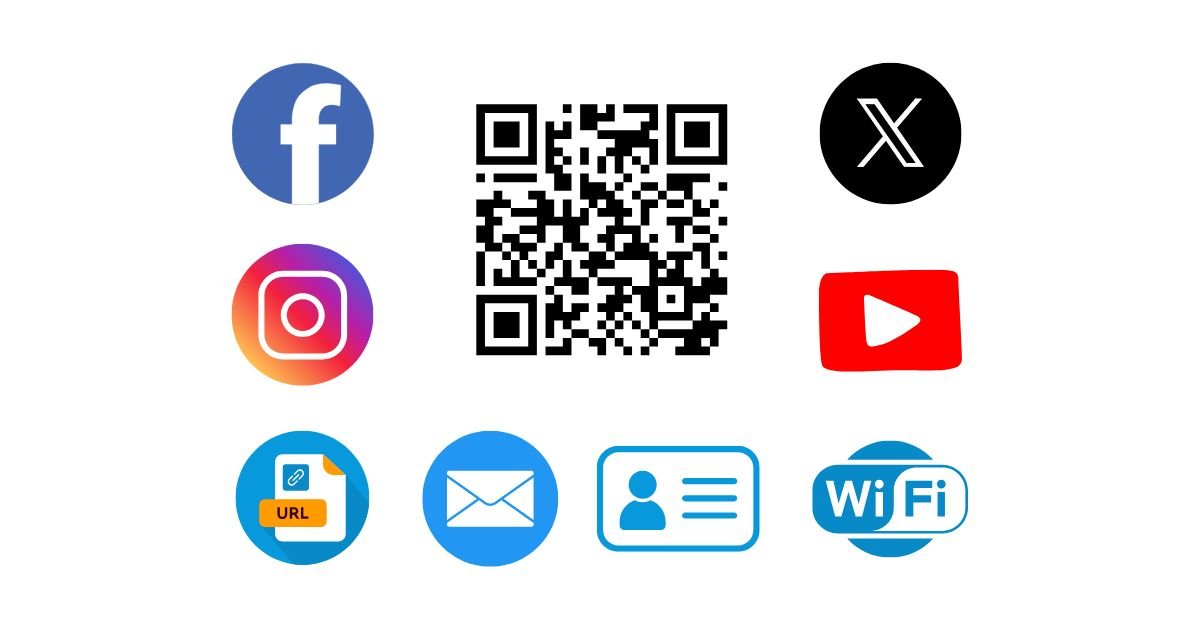
Useful QR content types (that convert)
Link to a mobile-friendly landing page. Use short paths and UTM tags if you track campaigns.
Share SSID & password; pick the correct security type (WPA2 vs WPA3).
Instantly add your contact. Keep fields short to reduce density.
Pre-fill a message (feedback, support). Great for offline posters.
Generate all of these with the QR Code Generator.
PNG vs SVG (and when to use each)
- SVG (vector) — best for print, signage, and resizing without blur.
- PNG — great for web and documents; export at 1024–2048 px for crisp results.
- Avoid heavy effects (shadows, gradients) that reduce contrast.
Testing checklist
- Scan with multiple phones (iOS/Android, older + newer models).
- Test in bright light and low light; check glare on glossy paper.
- Test from the intended distance and angle (e.g., standing at a poster).
- Confirm the landing page is mobile-friendly and loads fast.
Troubleshooting
Won’t scan unless very close: code is too dense or too small → shorten the URL and re-export larger.
Scans on some phones only: increase contrast and quiet zone; avoid light foreground colors.
Logo breaks the code: shrink the logo and raise error correction to Q/H; keep finder corners clear.
Works on screen but not in print: print quality too low or glare—use matte stock and higher resolution.
Previous
PDF to Word Converter — Get Clean Conversions
Next
JSON Formatter 101: Common Errors and Quick Fixes